Component Features
Form Design & Building
-
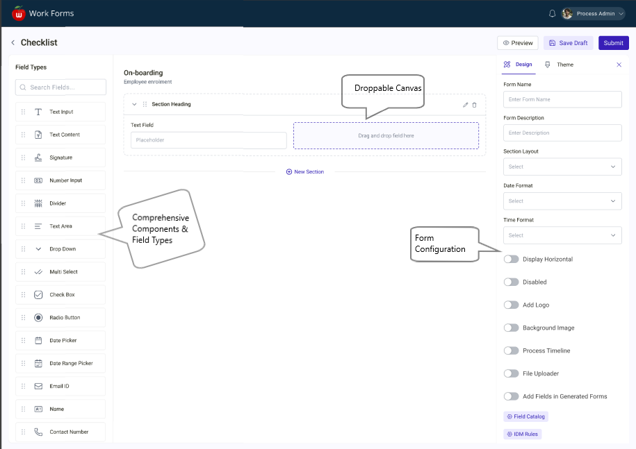
Visual Drag and Drop Builder — build fully functional forms without writing any code by dragging and dropping components onto a configurable canvas, providing an intuitive and user friendly experience
-
25+ Component Types — a comprehensive library covering Text Input, Number Input, Text Area, Email, Dropdown, Composite Dropdown, Multi Select, Checkboxes, Radio Buttons, Switch, Date Picker, Date Range Picker, Signature, File Uploader, Table, Name, Contact Info, Link, Divider, Text Label and more
-
Flexible Section Layouts — supports single, two, three, and four column layouts allowing form designers to control the structure and arrangement of each section independently
-
Customizable Field Settings — every component exposes a full set of configurable properties including label, placeholder, tooltip, mandatory toggle, disabled state, display orientation, area width, and datasource configuration
Functionality & Behavior
-
Theme Support — comprehensive theming options to control fonts, colors, and spacing across the entire form
-
Advanced Validation — built in validation rules per component, plus support for custom validation expressions to ensure data integrity
-
Field Dependencies & Conditional Logic — fields can show, hide, or change behaviour based on conditions in other fields. For example a Pincode field can be made dependent on a City field
-
Formula Generator — Number Input components support formula expressions that calculate values dynamically based on other fields in the form
-
Dynamic Attribute Management — components can be linked to dataset attributes with runtime label concatenation, placeholder customization, and display style control for precise form behaviour
-
State Management — uses Redux based state management internally to handle complex form scenarios and data flow across components
Integration & Deployment
-
100% Embeddable — runs entirely inside your existing React application as a library. Consumer apps take the build artifacts and integrate them directly — no iframe, no external hosting required
-
Dynamic Form Generation — forms can be generated on the fly from pre-built configurations making it scalable across multiple use cases
-
Full Backend Control — form data is intercepted via an onSubmit callback and sent to your own backend and database. No data goes to a third party cloud
-
Responsive Design — built on MUI ensuring forms are mobile friendly and work across all screen sizes and devices
-
Seamless Multi-Platform Integration — deployed across multiple consumer applications such as IMO (Intelligent Maintenance and Operations) and IWM (Integrated Work Management) creating a unified form building experience across the enterprise
-
Enterprise Security — authentication, data storage, and deployment all happen within your own infrastructure giving full security control
Modules Overview
The application consists of the following modules:
- Visual Form Builder / Drag-and-Drop Interface
- Comprehensive Components & Field Types
- Customisable Layouts & Sections
- Customisable Field Setting
- Theme Support